You have 90 seconds.
That is the average time it takes for a trade show attendee to form a first impression of your brand. And according to research published in the journal Management Decision, up to 90% of that snap judgment is driven by color alone – before they read a single word on your graphics, before they speak with anyone on your team, before they touch a product.
Color is not decoration. It is your booth’s first salesperson.
For exhibitors showing at the Orange County Convention Center in Orlando FL one of the busiest convention venues in North America, hosting more than 200 events every year – this matters more than most people realize. When you are standing on a show floor alongside hundreds of competing booths, the right trade booth design in Orlando FL does not just look good. It communicates, it attracts, and it converts.
In this guide, you will learn exactly how color psychology works on a trade show floor, what each color signals to visitors, how to match your palette to your industry and audience, and how Orlando Exhibit Rentals uses these principles to build booths that stop people mid-aisle.
What Is Color Psychology and Why Does It Matter at a Trade Show?
Color psychology is the study of how different hues influence human mood, perception, and behavior. The science behind it is well-established – colors trigger emotional and physiological responses that happen almost automatically, without conscious thought.
On a trade show floor, this matters enormously. Visitors are overwhelmed with visual input. Their brains are constantly filtering out noise. Color is processed faster than text and faster than images, which means it is the very first signal your booth sends before anyone gets close enough to read your headline or talk to your team.
A booth with the wrong color palette can feel cold when it should feel approachable, or chaotic when it should feel premium. A booth with the right palette pulls people toward it almost magnetically – they often cannot explain why they walked over, but color is usually the reason.
At large Florida trade show venues like the Orange County Convention Center, where some events draw tens of thousands of attendees across hundreds of thousands of square feet of exhibit space, color strategy is one of the most practical competitive advantages available to an exhibitor. It costs no more to choose the right colors. But the difference in booth traffic and in the quality of conversations that result can be significant.
This is why every Orlando trade show booth rental project at Orlando Exhibit Rentals starts with a color conversation, not a dimension’s conversation.
The Color Wheel for Exhibitors: What Each Color Signals to Trade Show Visitors
Here is a practical breakdown of the most common colors used in trade show booth design, what they communicate, and when to use them.
Blue - Trust, Stability, and Professionalism
Blue is the most widely used color in B2B trade show booths, and for good reason. It signals trustworthiness, reliability, and calm expertise. For SaaS companies, financial services brands, aviation exhibitors at MRO Americas Orlando, and healthcare brands at events like BICSI, blue immediately positions a company as credible and established.
Navy and deep royal blue work particularly well under the overhead lighting conditions at the OCCC, where lighter blues can appear washed out.
Red - Urgency, Energy, and Action
Red is powerful but should be used carefully. As an accent color on a call-to-action counter, a product demonstration station, or a limited-offer banner red creates urgency and draws the eye from across an aisle. Used as a dominant color across an entire booth, red can create visual anxiety that actually drives visitors away rather than pulling them in.
The rule: red as an accent works. Red as a backdrop rarely does.
Green - Sustainability, Health, and Calm
Green has become one of the fastest-growing choices in trade show booth design over the past two years as brands across industries signal environmental awareness. For wellness brands, pool and spa exhibitors at Everything Under the Sun Expo in Orlando, and outdoor lifestyle companies, green creates a refreshing, calm environment that invites visitors to slow down and engage.
Deeper forest greens and sage tones read far better under trade show lighting than bright lime tones, which can feel harsh in artificial light.
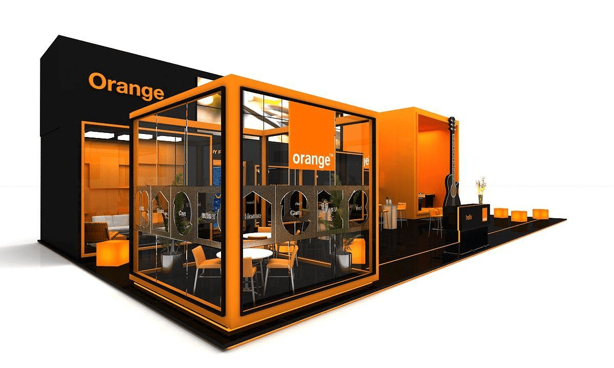
Orange - Approachable, Friendly, and High Energy
Orange occupies a sweet spot that red cannot: it is energetic and attention-grabbing, but it does not trigger stress. It encourages interaction and increases dwell time the amount of time a visitor spends in your booth. For consumer brands, lifestyle companies, and lifestyle exhibitors at Surf Expo Orlando, orange is an excellent primary or secondary palette choice.
Deeper forest greens and sage tones read far better under trade show lighting than bright lime tones, which can feel harsh in artificial light.
Yellow - Optimism and Innovation (Use Sparingly)
Yellow is the brightest color on the visible spectrum, which makes it highly effective at grabbing attention from a distance. However, large amounts of yellow create visual fatigue quickly. Use yellow as an accent color in signage highlights, backlit panels, or graphic borders paired with white or neutral gray for a modern, innovation-focused feel.
White and Neutral Tones - Premium, Minimal, and Modern
White and neutral palettes signal luxury and confidence. They let your products and messaging take center stage rather than competing with a bold backdrop. White booths tend to photograph exceptionally well, which matters for social media and post-show content. They pair best with one strong accent color that carries the brand identity.
At a Glance: What Color Should My Trade Show Booth Be?
The best color for your trade show booth depends on your industry and the audience you want to attract. Blue builds trust for B2B and tech brands. Orange and yellow increase approachability for consumer products. Green works well for health and sustainability brands. For Orlando FL exhibitors, working with a professional booth design team ensures your palette is matched to your specific audience, show environment, and brand goals.
Industry-Specific Color Strategy for Orlando FL Trade Show Exhibitors
Generic color advice only gets you so far. The most effective booth design in Orlando FL starts with your specific industry, your target visitor, and the event you are exhibiting at. Here is how color strategy shifts by sector.
Construction and Real Estate - IBS and KBIS Orlando
Exhibitors at the International Builders’ Show and KBIS at the Orange County Convention Center serve an audience of builders, architects, and remodelers. This crowd responds to colors that signal durability and quality craftsmanship: warm grays, rich navy blues, deep charcoal, and earthy tones. Bold red accents can be used strategically to highlight limited show pricing or new product launches.
Avoid overly trendy palettes in this sector. Your audience values reliability, and your colors should reinforce that.
Technology and SaaS
Tech brands at Orlando trade shows typically do best with clean blue-and-white foundations paired with a single electric accent – electric blue, violet, or a bold teal. The goal is to project innovation while keeping the design clean enough that product demonstrations and screen displays do not compete with the surrounding environment.
Negative space is a design tool in tech booths. Resist the urge to fill every surface.
Healthcare and Dental - Florida Dental Convention
For healthcare exhibitors at events like the Florida Dental Convention, cool blues and muted greens reinforce clinical trust and professionalism. One important note specific to this industry: avoid red as a primary or accent color. In a healthcare context, red triggers hospital and emergency associations that can make visitors feel uncomfortable rather than at ease.
Soft navy, slate blue, and sage green are reliable foundations for medical and dental exhibition booth design in Orlando FL.
Lifestyle, Surf, and Action Sports - Surf Expo Orlando
Surf Expo attracts a younger, trend-aware demographic that responds to bold, saturated color choices. Ocean blues, sandy warm neutrals, and neon accent tones are all on-theme and effective. High contrast is important here this audience is visually sophisticated and responds to design that feels current and confident.
For rental exhibits targeting this market, vivid printed fabric graphics with high-resolution ocean imagery can be an effective trade show display rental choice that stands out without requiring a massive budget.
Pet Industry - Global Pet Expo Orlando
The Global Pet Expo in Orlando draws buyers, retailers, and distributors from across the pet care industry. This is a warm, family-friendly environment, and your palette should reflect that. Orange, teal, warm yellow, and bright coral all work well. Avoid overly corporate palettes here they feel out of place in a show floor environment where playfulness and energy are genuine competitive assets.
Color and Light: How the OCCC's Lighting Environment Affects Your Palette
This is something many exhibitors and many national exhibit companies overlook entirely. The Orange County Convention Center, like most large convention halls, uses broad overhead fluorescent and LED wash lighting that has a direct impact on how your colors appear on the show floor.
Here is the practical consequence: light, pastel tones that look beautiful in a design mockup can appear washed out or flat under large-venue overhead lighting. A soft blush pink that feels elegant on screen may look almost beige when bathed in overhead fluorescent light from thirty feet above.
The solution is to shift to deeper, more saturated versions of your chosen palette. A navy blue holds under venue lighting where a sky blue fades. A forest green reads confidently where a mint loses its character.
Accent Lighting as a Color Multiplier
One of the most effective investments in booth design Orlando FL is strategic accent lighting. A well-placed LED wash over a backlit graphic panel can transform how your brand colors read from 20 feet away. Warm LED accents intensify orange and red tones; cool white LEDs sharpen blues and silvers. This is not a luxury add-on for island booths and larger exhibit spaces at the OCCC, lighting is one of the highest-ROI line items in a booth budget.
Validate Your Colors Before Show Day
At Orlando Exhibit Rentals, every booth project includes photorealistic 3D renderings that simulate the actual lighting conditions of your exhibit space. Clients review and approve their color palette as it will actually appear on the OCCC floor under venue-equivalent lighting before a single panel is produced. This step eliminates costly surprises at installation and ensures your exhibition booth in Orlando FL looks exactly as intended.
Common Color Mistakes Orlando Exhibitors Make (and How to Fix Them)
Even experienced exhibitors make these mistakes. Here is what to watch for.
Using Too Many Colors
The maximum is three: one dominant color, one secondary color, one accent. More than three and your booth starts to look busy rather than branded. Visual noise dilutes brand recall – visitors walk away without a clear color association with your company.
Ignoring Brand Consistency
Your booth colors must match your website, your brochures, your follow-up emails, and your social media. Brand recognition is built through repetition. If your trade show booth uses a completely different palette from your other marketing materials, you are starting from scratch every time a visitor looks you up after the show.
Low Contrast Graphics in Large Halls
Light text on a light background, or dark text on a dark background, becomes effectively invisible from aisle distance. This is one of the most common and most damaging mistakes in trade show graphics. A minimum contrast ratio of 4.5:1 between your text and background is a good standard to follow. If in doubt, go higher contrast, not lower.
Choosing Colors, You Like Instead of Colors That Convert
Personal preference is not a color strategy. Your booth is not designed for you – it is designed for the specific type of person you want walking into it. Before choosing a palette, brief your Orlando booth design team on your target audience, their industry, their average age, and the emotional response you want your brand to trigger. A color that feels sophisticated to one demographic can feel cold to another.
How Orlando Exhibit Rentals Applies Color Strategy to Every Booth
At Orlando Exhibit Rentals, color strategy is built into our design process from day one. Here is exactly how that works.
The Design Brief
Before we discuss booth size or layout, we ask questions: What industry are you in? Who is your target visitor at this show? What do you want them to feel when they see your booth from across the aisle? What do you want them to do when they walk in? These answers shape the entire palette decision.
3D Color Rendering Before Fabrication
Every client reviews a photorealistic 3D render of their booth before production begins. These renders are produced under simulated OCCC lighting conditions so the colors you approve are the colors you will see on show day – not a flat screen representation that looks different under venue light.
Full-Service from Design to Setup
Our turnkey service covers every element that affects how your colors appear in person: custom-printed graphics, booth lighting, furniture selection, flooring, and installation at the Orange County Convention Center or any other Orlando venue. Nothing is left to chance. When your booth is assembled, every color element is placed exactly as designed.
Ready to design a booth that stops attendees in their tracks? Get a free color strategy consultation with our Orlando booth design team.
Frequently Asked Questions
What is the best color for a trade show booth?
The best color depends on your industry and the audience you are trying to attract. Blue builds trust for B2B and technology brands. Orange and yellow increase approachability for consumer-facing products. Green signals sustainability and works well for health and wellness brands. A professional booth design company in Orlando FL will match your palette to your target visitor, your show goals, and the specific venue where you are exhibiting.
How does color affect trade show booth traffic?
Color is processed by the brain before text or images, making it the first impression your booth creates. Warm, high-contrast palettes attract visitors from a distance. Cooler tones encourage longer dwell time and deeper conversation once visitors are inside the booth. Strategic use of accent colors can direct foot traffic toward specific zones – product demonstration areas, meeting spaces, or information counters.
What colors work best at the Orange County Convention Center in Orlando?
Under the broad overhead lighting at the OCCC, deep saturated colors hold better than light pastels. Navy, forest green, rich burgundy, and deep charcoal maintain their character under venue lighting. Backlit graphic panels and LED accent lighting further strengthen color impact and help your booth design stand out in large, open exhibit halls.
How much does custom booth design cost in Orlando FL?
Custom trade show booth design in Orlando FL typically starts around $3,000 for a 10×10 rental exhibit and increases based on booth size, materials, technology integration, and graphic complexity. Rental options reduce upfront cost significantly compared to purchasing a custom exhibit outright. Orlando Exhibit Rentals offers transparent, all-inclusive pricing with no hidden fees.
Can I rent a booth with a custom color scheme in Orlando?
Yes. Orlando Exhibit Rentals offers fully customizable rental booths where your graphics, color palette, lighting, and furniture are all built around your brand. Everything is included in one turnkey package delivery to the OCCC or any other Orlando venue, installation, and teardown after the show.
How far in advance should I book a trade show booth design in Orlando?
Most booth design projects at Orlando Exhibit Rentals take between three and six weeks from initial brief to installation. For major OCCC events such as IBS, KBIS, or IAAPA Expo, booking eight to twelve weeks in advance is strongly recommended to allow time for design revisions, production, and logistics coordination.