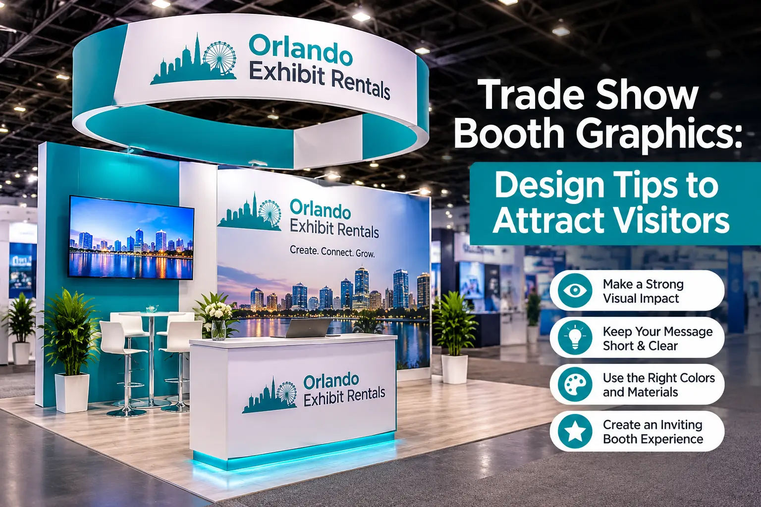
Anyone who has walked an exhibit hall at the Orange County Convention Center knows how quickly the eye sorts booths into the ones worth approaching and the ones to pass. Trade show booth graphics do most of that sorting, because a visitor reads a wall from the aisle long before reading a brochure or meeting your team. This guide explains how to design graphics that work at the distances and angles people actually see them from, with some notes specific to exhibiting in Orlando.
Think about where people will be standing
Most graphics are designed on a screen at arm’s length, which is the one place nobody will ever view them from. A visitor will usually first see your booth from the far side of an aisle, then from fifteen or twenty feet away, and only then from close enough to read smaller text. Each of those distances needs something different from the design.
From far away, the wall should communicate one idea through a strong image, a large headline and contrast that holds up under bright hall lighting. At mid distance, a supporting line can explain what you do or who you do it for. Up close, details such as product names, a web address or a short list of benefits are fine, as long as they sit where they will be read and are not hidden behind a counter or a crowd.
Height matters as well. Anything placed below roughly four feet tends to disappear behind people standing in the booth, furniture and product displays, so important messages belong in the upper two thirds of the wall. A useful habit is to print a small mock-up, tape it to a wall and step back across a room to see what survives.
Say less, and decide what the one message is
Walls with paragraphs of text tend to get ignored, since attendees are moving and scanning rather than reading. A short headline, a line of support and a logo cover most needs, and some exhibitors work to a limit of around seven words for the main message. The harder part is choosing what to say, because every department in a company has something it would like on the wall.
A helpful test is to ask what a stranger should understand about you after glancing at the booth for a moment. If the answer is “they make industrial sensors for food plants,” then the headline should say something close to that, in plain terms and in the words your customers use. Industry jargon, internal product codes and clever taglines that need explaining all cost attention you cannot spare.
Empty space belongs in the design too. Some designers aim for as much as a third or more of a graphic being open space, and while the exact figure matters less than the principle, a layout that breathes is easier to read from a distance than one filled edge to edge.
Treat seams, panels and structure as part of the layout
A booth wall is rarely one continuous sheet. It is made of panels, frames or fabric sections, and the places where they meet will cut through anything that crosses them. Letters split by a seam become hard to read, and a face or product photo cut at an awkward point looks careless.
Ask for the exact panel dimensions and a template before starting the design, then place headlines, logos and faces clear of the joins. If you are building custom trade show booth graphics around a specific structure, the template will also show where counters, shelves, monitors and doors interrupt the wall, which is information you want before you finalize the artwork rather than after.
Prepare files the way a large-format printer needs them
A graphic that looks sharp on a laptop can turn soft once it is stretched across eight or ten feet, and the cause is nearly always the source file. Logos should be supplied as vector artwork, in formats such as AI, EPS or a vector PDF, so they stay crisp at any size. Photographs should be large enough that, when scaled to the full print dimensions, they still hold detail. Many large-format printers work comfortably at around 100 to 150 dpi at full size, which is much lower than what brochures need, but a small web image enlarged to wall scale will not meet it.
A few more points are worth checking with the printer before you send anything:
- whether files should be built to scale or to a smaller proportion of the final size
- the color mode and how brand colors are matched, since screens and print rarely agree on a bright blue or orange
- how much bleed past the trim edge each panel needs
- whether fonts are outlined or embedded, so text does not shift when the file opens elsewhere
Colors deserve a short test if brand consistency matters to you. A printed swatch or a proof on the actual material will save an unpleasant discovery under the exhibit hall lights.
Choose materials for the trade show booth graphic you actually have
The same artwork looks different depending on what it is printed on. Tension fabric trade show booth graphics stretch over a frame, fold into a small case and tend to look smooth and even, which suits rental booths and shows where you ship or travel. Rigid panels give a flat, solid surface and are good for areas near the ground that take bumps.
Adhesive vinyl works for counters and flooring, though it is worth asking how it will be applied and removed, particularly in humid Florida conditions where adhesives can behave differently from what the supplier is used to.
Backlit fabric lights up from within, which makes it stand out in a bright hall, but it requires a frame built for it and a power source. If your show is at the convention center, remember that electrical service there is ordered through the venue itself, so a backlit wall needs to be planned into your power order early.
For exhibitors choosing a 10×10 trade show booth, a single large backwall in fabric is often the most efficient use of a small footprint, since all the graphic impact sits in one clean plane and nothing competes with it.
Lighting changes how custom trade show booth graphics read
Exhibit halls are brightly and often unevenly lit, and graphics that looked rich in a studio can look washed out once overhead lights bounce off a glossy surface. Matte finishes cope better with glare than high-gloss ones. Dark colors on a dark backdrop lose definition quickly, so contrast between text and background matters even more than it does on a website.
Adding lighting to the wall itself, whether through track lights, LED strips or a lightbox, gives you control that the hall does not. It is also worth looking at what is hanging overhead, since signs, trusses and other exhibitors’ structures can cast shadows across your wall at certain times of day.
Plan for an island booth with several viewing sides
When a booth is open on more than one side, such as a corner or a full island, graphics have to work from every angle that faces an aisle. A single wall of text will not be seen from the back, and visitors approaching from different directions should each see a clear message rather than the unfinished edge of a structure.
For a 20×20 trade show exhibit, designers often assign a different job to each face: one carrying the main brand statement, another focused on a product or service, a third leaving room for screens or demonstrations. Hanging signs, if the venue allows them, give you a view from across the hall, though they usually require approval and have their own height rules found in the exhibitor manual.
Build graphics you can use more than once
A booth that is completely redone for every show costs more than most companies need to spend, so it helps to design a system rather than a single image. That might mean a consistent logo placement and color scheme, with one panel or banner swapped out for each event’s message or audience. Neutral base walls with changeable inserts also make it easier to update a product name or a date without reprinting everything.
This approach works especially well with an Orlando trade show booth rental, because the structure and furniture are supplied and the part you control is the artwork. You can keep your core files, adjust the message for each audience and avoid paying to redesign a wall that mostly stays the same.
Check the proofs the way a visitor would
Mistakes in booth graphics are expensive because they are large, visible and difficult to fix on site. Before approving a proof, read every word aloud, check phone numbers and web addresses against a trusted source, and have someone who did not work on the design look at it. Check that images are not stretched, that nothing sits too close to an edge or a seam, and that the logo matches the current brand version.
Look at the proof on the booth structure if you can, either in a rendering or a mock-up. A design can seem fine in isolation and still lose its headline behind a counter or have a monitor sitting where an important image was meant to go.
What custom trade show booth graphics support in Orlando looks like
Exhibiting in Orlando usually involves a tight window between delivery and show opening, and graphics are one of the items that depend on approval, printing and shipping all falling into place. The most reliable way to avoid problems is to work with a company that handles design, production and installation together, so that the artist, the printer and the install crew are looking at the same plan. The team at Orlando Exhibit Rentals works with exhibitors at the Orange County Convention Center, Rosen Shingle Creek, Gaylord Palms and other local venues, and handles trade show graphics Orlando exhibitors need as part of the full booth rather than as a separate task.
If you want to see how different approaches look once they are built, a good place to look is the set of booths built for Orlando shows, which shows how layout, wall graphics and furniture work together on the floor.
Getting your graphics planned
If you are putting together a booth for an Orlando event and want the artwork, structure and setup to line up, send the show name, booth size and brand files and ask for a quote for graphics and booth rental. The earlier those details arrive, the more room there is to test layouts and correct anything before printing begins.
Questions exhibitors ask about booth graphics
How much text should be on a booth wall?
Much less than most people expect. A headline, a short supporting line and a logo carry the message from the aisle, and the details can be handled by your team and printed material.
What is the difference between trade show display graphics and signage?
Display graphics usually refer to the large printed pieces that make up the booth, such as backwalls, banners and counter wraps, while signage tends to mean standalone or hanging signs. Many booths use both.
Can I reuse graphics at another show?
Often yes, especially fabric graphics that are cared for and stored properly. Designing a flexible system, with a few swappable elements, makes reuse practical even when messages change.
When should graphic files be sent?
As early as possible, and certainly before the production deadline in your rental or exhibitor agreement. Approvals, printing and delivery all take time, and a booth installed with finished graphics is easier to set up than one waiting on a late shipment.
Do I need custom graphics, or can I use templates?
Templates can work for a first show or a short timeline, though custom graphics let you match your brand and message more closely. A designer can often adapt existing brand assets to a booth faster than starting from nothing.
CONTACT US
AND AN EXHIBIT EXPERT WILL GET BACK TO YOU SHORTLY!
